Styling blocks
Colours, gradients, spacing, borders, ticks, animation and device visibility.
1 min read · updated 1 October 2026
Select a block and open Style on the right. Everything here works the same for every block.
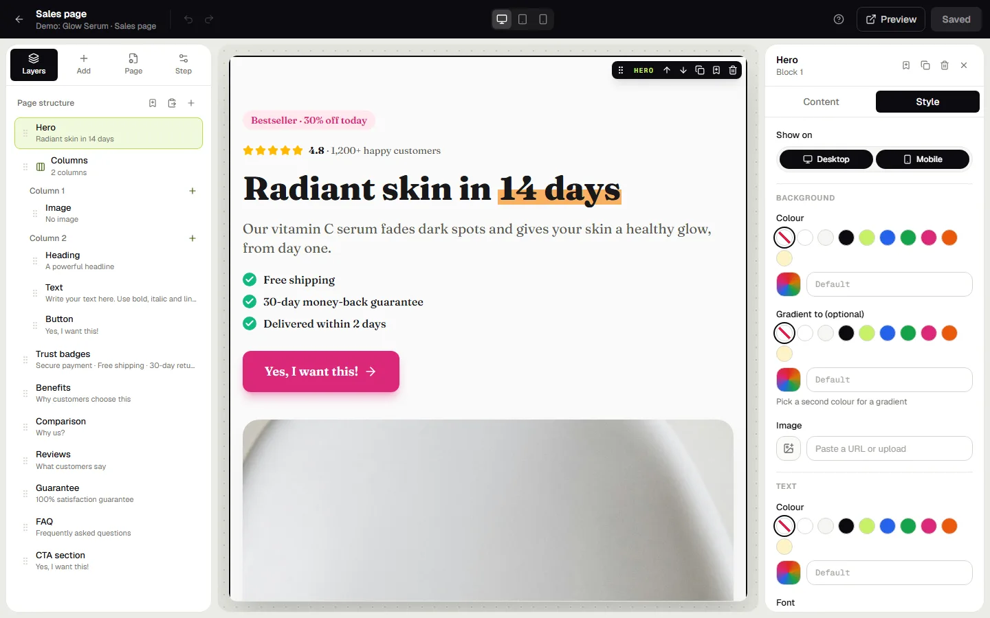
Background
A colour, a gradient (pick a second colour and an angle) or an image with an adjustable dark overlay.
Text
Text colour, font (modern, clean, elegant or technical), size and alignment. The font here overrides the funnel font for this block only.
Ticks & icons
Pick the colour of every tick and badge icon in the block, and their style: a filled circle, a filled square or just the tick.
Size & spacing
Content width (narrow, normal, wide, full width), an exact maximum width, and space inside and outside the block, all with sliders.
Border & shadow
Show the block as a card, round its corners, add a border and choose a shadow from subtle to dramatic.
Animation
Let a block fade, slide or zoom in when it scrolls into view. Animations only run on the live page, never in the editor, and respect visitors who prefer reduced motion.
Show on desktop or mobile
At the top of the right panel you can hide a block on phones or on larger screens. In the editor it stays visible but greyed out, so you can still select it.
Advanced
Give a block an anchor ID so buttons can scroll to it, or a CSS class you style under Page → Custom CSS.
Was this guide helpful?
Try it in your own store
Free for 14 days. Every feature, no credit card.