All blocks, and when to use them
A tour of the block library, from headings to product buy boxes.
1 min read · updated 1 October 2026
Pages are built from blocks. Here's what each group is for.
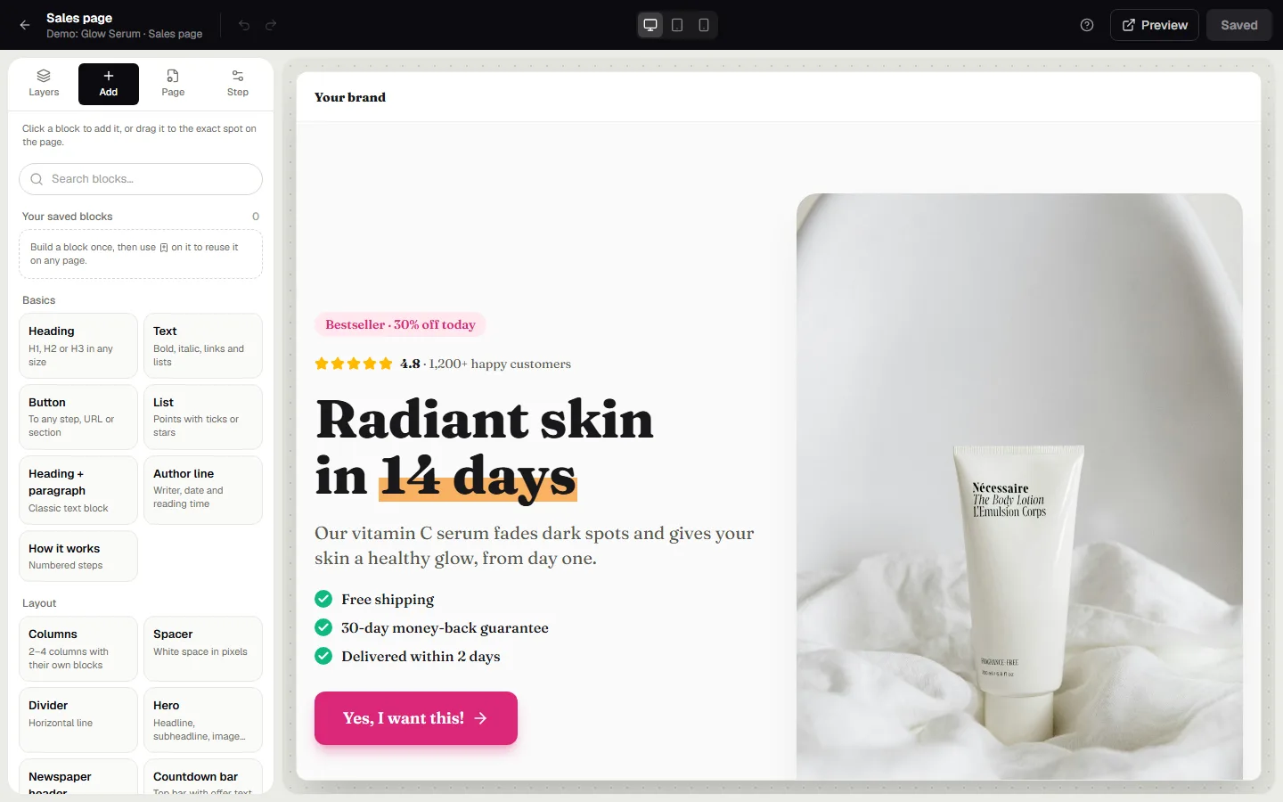
Basics
- Heading, Text, Heading + paragraph: your copy. Text supports lists and links.
- Button: to the next step, a specific step, a URL or a section. Choose its icon, shape and an optional pulse or shine effect.
- List: points with ticks, stars, arrows or dots.
- How it works: numbered steps.
- Author line: writer, date and reading time, for article-style pages.
Layout
- Columns: two to four columns, each with its own blocks.
- Hero: headline, subheadline, image, benefits and a button.
- Image + text: a picture beside a story, left or right.
- Announcement bar, Countdown bar and Scrolling text: short messages at the top or between sections.
- Newspaper header: a masthead with date and menu, for advertorials.
- Spacer and Divider.
Media
Image, Gallery, Image slider, Video (YouTube, Vimeo or mp4), Logos and Before / after, a slider shoppers drag to compare two photos.
Sales
- Product buy box: photo gallery, rating, price with discount badge, ticks, a big button and a review.
- Offer card, Pricing (packages side by side, each can link to a product), Benefits, Comparison, Numbers, Specifications.
- Countdown, Stock and Progress bar for honest urgency.
Trust
Reviews, Big quote, Rating, Guarantee, Trust badges, Payment methods and FAQ.
Forms & code
Opt-in form (email, optional name and phone), Survey (one question) and Custom code for embeds like Calendly or Typeform, safely sandboxed.
Tip: use the search field in Add to find a block by name.
Was this guide helpful?
Try it in your own store
Free for 14 days. Every feature, no credit card.